Exploring the Art of Food Plating: Turning Meals into Masterpieces
The way food is presented plays a crucial role in how it is perceived by diners. Visual appeal is often the first aspect of a dish that captures the attention of the eater. Aesthetically pleasing presentation can heighten the overall dining experience and even influence how the flavors are perceived by the consumer.
Additionally, the presentation of food can convey important messages about the quality and care that has gone into its preparation. A beautifully plated dish can indicate attention to detail and a level of skill in the kitchen. On the other hand, poorly presented food may give the impression of carelessness or lack of regard for the customer’s experience. Ultimately, presentation is an integral part of the dining experience that can elevate a meal from ordinary to extraordinary.
The Role of Color in Food Plating
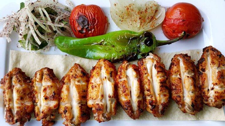
Color plays a significant role in food plating as it not only enhances the visual appeal of a dish but also influences the perception of taste. Bright and vibrant colors tend to be more visually appealing and appetizing, while muted tones can create a sense of sophistication or earthiness in the presentation of food. When selecting colors for food plating, chefs often consider the overall theme or mood they want to convey to diners.
In addition to aesthetics, colors can also be strategically used to create contrast and balance on a plate. By incorporating a variety of colors, chefs can draw attention to different components of a dish and create a visually dynamic presentation. Contrasting colors can help highlight textures and flavors, making the dining experience more engaging and enjoyable for the senses.
Texture and Contrast in Plate Design
Achieving a harmonious balance of textures and contrasts on a plate is essential for creating visually appealing and enticing dishes. When designing a plate, consider incorporating a variety of textures such as crispy, creamy, crunchy, and chewy elements to add depth and complexity to the overall dining experience. By juxtaposing textures, you can elevate the sensory journey of each bite and keep diners intrigued.
Contrast in plate design goes beyond just textures – it also involves playing with colors, shapes, and flavors to create a visually striking presentation. Contrasting elements, such as pairing smooth sauces with crispy vegetables or placing a vibrant garnish against a neutral backdrop, can make the dish pop and capture the diner’s attention. The strategic use of contrast not only enhances the aesthetic appeal of the plate but also influences the perception of flavors, making the dining experience more memorable and satisfying.